When we spent a while in the US in the eighties I was amazed and amused by the silly warning “serving suggestion” found on food packaging. I mean, what were they afraid of… a flood of lawsuits by people that opened the soup powder sachet and failed to extract a steaming soup tureen?…
Like many a silly idea this practice hit Israel a few years later, and I stopped noticing it – until this caught my eye:

This has the ubiquitous “Serving Suggestion” in fine print; what makes it unusual is two incongruities:
- Slicing one tomato in half hardly counts as a serious serving suggestion.
- These tomatoes would require a Magician to be served in this way. You see, the caption on the green stripe says “Crushed Tomatoes”!
I don’t expect the marketroids at Yakhin food products to be fluent in the laws of thermodynamics and entropy, but even they must know that you can serve a whole tomato by crushing it, but you can’t make a crushed tomato whole again.
Bon Appetit!
People who design signs ought to be careful, because thoughtless signage can so easily lead to confusion…
Public restroom signs are a case in point, because people who see them make assumptions. For instance, as someone once pointed out, if one sees a WC sign of the opposite gender and the one for one’s own use is not next to it, one can go seek it at the opposite end of the same floor, or in the same position on the floor above or below… there is rarely a sign to tell you which is the case.
And here is another example in this domain: I saw the sign on the left near the door to a single restroom in a large building lobby. The immediate assumption of the user is that this is a handicapped-only room, and they go looking for the Gents’ or Ladies’ room. Which is not there, because this is the only restroom in the place. The intent of the sign, no doubt, was to indicate “here is the restroom, and it is wheelchair-enabled”.
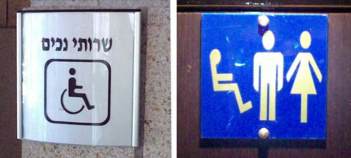
The sign on the right is far better – it is again a single facility, but there is no mistaking the fact. Though it is interesting that the fellow on the left seems to be levitating… 🙂
You need to speak Hebrew and French to detect the hilarity of this photo:

Here’s the thing: the package contains a local make of Petit Peurre cookies, a timeless biscuit design. However, someone decided to brand it as PTIBER GADOL – literally, “Large Petit Beurre“. Except that Petit, of course, means Little…
Oh, and incidentally, neither the package nor the biscuits deviate from the standard size we’ve had for ages. The only large thing about this product is the silliness of the branding.
Was looking up RosettaStone, that Rolls Royce of computer-based language teaching tools. They have a nice web site with demo videos and all – very handy. And they had a video there promoting their system, and as it zipped past something seemed wrong. I rewinded a bit and there it was: my native Hebrew language, in a pattern that made no sense at all. It took a second to resolve: they had the hebrew word for Succeed – written backwards, left to right.

Of course it’s not uncommon to see a Windows program mess up the text direction of Hebrew (and, I suppose, other RTL languages) – after all, Redmond is not in Israel – but you’d expect a Languages school to catch this blooper…
Every child knows that postage stamps are affixed to the top right corner of the envelope. You lick the stamp, and you press it to the envelope at that corner. And it stays there. Or does it?…

I was sending greeting cards recently, putting them in the envelopes they came with. Some of them sported envelopes made of some shiny gold-colored paper. I licked the stamp, put it on the paper… and in a few minutes, as soon as it had dried, the stamp would pop up, curl, and drop off. The envelope was golden, but it could not hold a stamp. You’d think the card manufacturer would pay attention to such a detail?!
We all know the paper towel dispensers that you crank to get the required length out. The more sophisticated ones dispense with the crank action and use an electric motor actuated by a proximity detector: wave your hand in the air in front of the machine and out comes the preset length of paper with a satisfying whirring sound. Hygienic, neat, and foolproof.
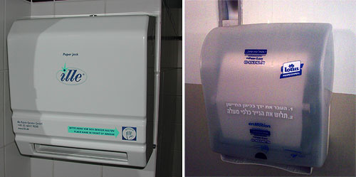
But even with this foolproof concept there are different designs. The device at the left in the photo tells you to wave your hand to the right of the paper outlet slot. The one at the right has the sensor centered above the slot’s middle. Why does this matter? because the average person will reach out for where the paper is expected; with the second unit this will trigger the sensor, whereas with the first, it will not. Then you have to start groping and try to figure it out, and maybe notice the frantic effort the vendor made to guide you: the picture of a hand titled “sensor”, the big blue arrow pointing to it, and the text captions that try to make it all clear.

All nice and good, but a towel dispenser is not a literary work, and should not rely on texts and explanations. Had they put the sensor in the middle all this would’ve been unnecessary…
We saw that Newark Liberty International airport has some serious problems keeping its electronic signs straight… here, and here. Well, here’s a third and (for now) last installment.
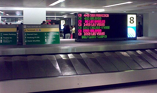
This is the baggage claim area at the Continental domestic terminal where I landed coming in from San Francisco.
See the nice colorful sign identifying this baggage carousel, number 8, as the one where luggage from flight CO449 is about to appear.
See the nice empty belt on carousel 8.
See the nice people thronging carousel 7 further back.
They’re retrieving their luggage, newly arrived from flight CO 449 from San Francisco.
How nice…
We’ve discussed Engrish before… it’s always hilarious, but this one beats them all. Read it through!
This is from a very nice flannel shirt imported by Azouri Clothing Ltd, and manufactured in China.
The amazing part is that in addition to mangling the spelling and grammar, as in “You can’t using bleash”, which is fairly normal, these folks invented some linguistic innovations that – at first glance – seem to reflect some serious erudition, like “hydrograph”, “wield”, “fumigator” and “micro therm smoothing” (“ironing” to the rest of us). It sounds like the output of an English professor who was locked in a dungeon for decades until he went mad…
And if you can decipher “powder of in dusion bleach”, do share!
We saw how the electronic boards at Newark Liberty airport made the ridiculous omission of adjusting for the Daylight Savings move. Evidently this is not an exception: something is very wrong with that airport’s electronic signage.
These guys have an “Airtrain”, an internal elevated light rail system for moving between terminals. The train has two parallel tracks, and there are electronic signs at the stations to indicate which is which. Thus, the sign in the photo indicates that the train on the left goes to terminals A,B, and Parking areas 1 through 3; the other train goes to P4 and to the train link to NYC.
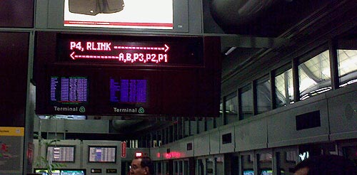
Except that they also had a backup system. They placed a uniformed woman with a loud voice that announced repeatedly: if you want to go to terminals A, B, and P1-P3 you must take the train on the right. The signs, so convenient and visible, were displaying the wrong information.
You’d think the lady, who was no doubt equipped with a cellular phone, could set the error straight in a jiffy by calling some control room; but that didn’t occur to anyone. And after all, who are you gonna trust: a computerized board, or a well-meaning person of your own species?
Had to take a flight out of Newark airport on the morning after the move from daylight saving to winter time. The preceding evening I took good care to set my alarm clock and wristwatch back the required hour, and took off to the airport in the morning. And when I got there, I was amused to see the many and wonderful electronic displays that are all over the place all showing an hour late.
Now, these boards and clocks are all computer controlled, and you’d think they’d let the computers handle the time shift; my own Notebook and Smartphone both did without human intervention. But even if they installed systems based on human clock-setters, like they did with the big clocks of earlier eras, surely they could’ve done the job right – and, if not, corrected the mess when it became all too visible in the morning?…

