Archive for the 'Bad design' Category

Android vs. Palm: the lost art of keeping it simple

Back then we had the Palm Pilot. It had a gray lo-res screen and minimal capabilities. No wireless, no GPS, no games, just basic PDA funcfions. Compared to the android phone I use now it was like a stone ax. And yet, that old Palm had a key attribute that is long lost: simplicity of use.

Palm PilotA prime example: the “EDIT” button. Take the common task of modifying a memo or appointment. In Android, you have to open the item, and then hit EDIT to enter a mode where you can make your changes. And when you’re done you hit SAVE. Makes sense? Not really. In PalmOS you opened the item and just started typing. Edit mode and View mode were one and the same. Just like a sheet of paper: you can read it and you can write on it as you wish.

It may look like simple matter, but all those extra clicks do add up and clutter the user experience; what’s more, they detract from elegance – that intangible element which calls for keeping it simple!

Indoor chair, outdoor chair

I was in the campus of the Academic College of Tel Aviv and l noticed a little courtyard with a nice deck and some garden furniture. What caught my eye was that the chairs were tilted against the tables.

DeckChairs1.jpg

The reason became obvious when I saw one chair that had remained upright: it had a puddle of rainwater in its elegantly concave seat.

DeckChairs2.jpg

At first I was annoyed by what seemed an obvious design flaw: surely a small hole drilled in the middle of the seat would have solved this issue – what a stupid way to design an outdoors chair! Then I realized that these were no outdoors products. They were regular chairs that someone had probably repurposed for garden use in sunnier times, proving that one should be more careful with ignoring a product’s spec.

And then I noted a little round mark on the bottom of each seat, in just the location I would’ve drilled that missing hole in. Evidently, the manufacturer had foreseen the dual use of this plastic chair, and had prepared to provide for both uses. Still, the end user had used the wrong version – and had neglected to correct the problem, which a minute with a drill would have easily done.

Target practice

Coffee machine
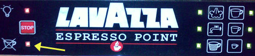
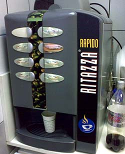
We all know these automatic coffee machines: you place a paper cup under the nozzle, hit a button, and out comes a flow of some sort of coffee or chocolate drink. The machine at right is a good example.

The problem with such manual cup placement is that you risk misaligning the cup to the nozzle hidden in the machine’s innards; that’s why the surface you place the cup on is a grille, to allow any spilled liquid to collect out of sight. The machine in this photo has such a grille, elegantly formed into an ellipse. But it has a glaring design flaw…

Below you see two such grilles from two other machines. Both have a circle showing you the target, the optimal location to place your cup in; one even has the targets for either one or two cups.

Coffee machine targets

But the machine shown at the top of this post has no such target – or rather, it does have a tagret arrangement of sorts – concentric ellipses – which has nothing to do with where to place a cup. And indeed, when I snapped it it had a nice coffee stain to show for this design oversight…

CoffeeTargets2.jpg

Plug and Gag, Take 2

A while ago I took HP to task for their tendency to fill your hard disk with hundreds of Megs of software when all you need is a printer driver. I am happy to report that they’ve improved their ways… sort of.

Back then, I wrote:

It is not good manners to sell someone a printer, and then to blast hundreds of megabytes of software onto their hard disk, without so much as a pretty please.

So now I bought a new HP printer and this time it did say pretty please. It asked me whether I wanted a full installation or a minimal installation. Hooray! Of course I opted for the minimal one… I would report happiness, except that the minimal installation – the bare essentials, according to HP – filled 461 Megabytes of my hard drive. Want to guess what a full install would have required?  🙁

What would they need 461MB for? Well, I haven’t even begun to explore the content of this unwanted bloatware, but I can report that the installation process included animated videos showing how to plug the darn machine into the power socket, and so forth (and these are still on my drive, in case I might forget how that is done…)

Plus ça change, plus c’est la même chose, I guess…

The abused art of form design

People who design forms never cease to amaze.

This was very obvious in the era of paper forms. You’d get forms with fields that are patently too small for their content; like this snippet from one I recently filled:

Name ______________________________ E-mail ___________

Cellular: _____________________________________________

What were they thinking?? Many email addresses won’t fit on that short line; and the next line is far too long for a phone number. Why not switch the slots?

This situation is very common, especially when it comes to addresses; you often end up overflowing the allotted space, which can result in barely legible data. Which is really weird, because with a five minute effort the form’s designer could have made things right for thousands of users later on. Don’t they see how ridiculous it all is?!

Another problem is forms that get photocopied and/or faxed so many times that they’re barely legible at all; strangely, bureaucrats seem not to mind getting back forms whose fixed portion is smudged and illegible. Evidently it’s the act of forcing us to submit a formal form that counts, not whether you can read it…

And now, we are paperless; you’d think all would be well with electronic forms… but no. Some organizations I deal with actually mail you a scan of a smudged photocopy of a paper form, and ask you to print it out, fill it with pen and fax it back, adding to the smudging. And even when they send an editable electronic version, they never use the features available in the  Word or PDF formats to steer the filling of the right fields. Instead, they just send around a plain document and expect you to type in the data; and since they use underlines to denote fields, we end up with forms like this:

First Name __________John Smith________________________

Address: ________100 Main street_______________________

and so on…

At least in this last case, you can put things right – put the word processor in Overwrite mode and replace the underlines with your text, or just delete the underlines, ending with:

First Name: John Smith

Address: 100 Main street

Then, if you import a scan of your signature in, you can send the filled form back as an attachment and be done with it!

Lavazza’s confusion

Lavazza Espresso point machine
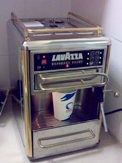
I was visiting an office where they had one of these delightful Espresso machines, an Espresso Point by Lavazza, and tried to make me a cup.

I put in a paper cup and a coffee cartridge, pushed the button at the right of the panel next to the size I wanted, and instead of that steaming coffee, I got a blinking red light at the left (marked below with an arrow).

I tried to puzzle the meaning of this light. It had the icon you see, with a coffee cup and an X. What did it mean? Obviously in a large beverage dispensing machine it would stand for “I’m out of cups”; but this machine did not store cups. It might mean “You forgot to put in the cup” – only I hadn’t. What else? “Smash a cup before I agree to make coffee”?

After much futile experimentation a local came and said “Oh, the machine is out of water”, and she proceeded to pour some in at the top. I could finally enjoy my coffee.

Lavazza Espresso Point machine - control Panel

But what a stupid design choice… the cup with the X has no relation to missing water; and indeed, the fact that the cup looks identical to those in the icons at the right side of the panel only reinforces the mis-interpretation.

Shame on you, Lavazza designers!

Another ridiculous serving suggestion

I’ve discussed before the silliness that results when overcautious lawyers and thoughtless designers cooperate to create silly “serving suggestions”… and here is a lovely new example.

Serving Suggestion
Salt package

In itself this salad may be a good serving suggestion for a package of cucumbers (or of parsley, perhaps)… but this is not what this image is displayed on. Instead, it is shown on the package in the photo at right.

Yes, this is a package of plain table salt!

I can’t wait for a producer of mineral water to think up a “serving suggestion” for plain water. Until then, this one will remain a winner on my list of pointless package legalese.

How do you say “Plug and Play” in Russian?

We got this new Samsung flat panel TV, and when I first turned it on it went straight into a “first time setup” sequence. The first question that appeared on the OSD (On-Screen Display) was which language I wanted for the OSD; I started scrolling among the options, and my finger slipped and hit the “enter” button when the option “Russian” was selected. The OSD obediently changed to Cyrillic script, and presented me with the next setup dialog. In pure Russian. Yay.

Unfortunately, there was no “Back” button with a universally understood back arrow, so there was no way I could go back and un-choose Russian; or if there were, it was described in Russian right in front of me – and I don’t know this language. I tried mucking around the interface at random, but to no avail. I thought of reverting to factory settings, but the manual said I need to find the option “Plug and Play” – and I really couldn’t say what that phrase looks like in Russian, even if it were written in Latin characters, which it wasn’t.

And there things stood, until I remembered that Samsung had delivered the TV with three copies of the manual, in English, Hebrew and Russian. By carefully using this as a Rosetta Stone, I managed to find the equivalent Cyrillic words and finally found them in the UI. Once reset, I was back with an OSD I could read.

Poor interaction design, Samsung!…

The chimeric camels of China

In times of old,  intrepid European explorers who ventured into remote countries like China or Africa would return with travelers’ tales of amazing creatures such as have never been seen. And apparently such wonderful animals still exist in far away lands, reflected in the meager evidence that filters back. Take this sighting…

Camel Donkey from China

I saw these small figurines – and dozens like them – on display at a souvenir shop in Ben Gurion International Airport. Nothing surprising about camel figurines in an Israeli tourist trap, after all we do have camels in this country, though you’d need to travel far into the desert to find any. The price tags said these were made in China – no surprise there either, everything is these days.

There were two models: a kneeling animal, with the unmistakable hump, thin legs,and small-eared head of a camel; and a standing one, with the hump of a camel, and the short thick legs, long ears, and stiff mane of a… donkey. Indeed, other than the hump, the Chinese craftsman has done an excellent job of capturing the anatomy of this patient beast of burden. The travelers were right: wondrous chimeric beasts must exist in China, and they seem to inspire Chinese product design!

More signage silliness

I was in a shopping center and I saw these two signs on different floors, pointing out the emergency stairs’ entrance.

Now, the sign on the left is well drawn and clear – the guy is purposefully descending the stairs. But the sign on the right has something very wrong…

Stairwel signs

It’s a bit hard to say exactly what it is with this poor chap on the sign… does he have a broken arm? A bad knee? Is he climbing the stairs or descending them? Perhaps the best description is that he’s drunk and wobbling about on the stairs.

Oh well…