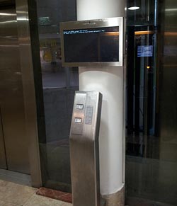
 When Elisha Otis invented the ‘safety elevator’ mechanism in 1852, elevator crashes have become a rare event indeed. But these days “crash” has a new meaning, which Otis couldn’t have foreseen. Consider the elevator in the photo, from the Azrieli towers in Tel Aviv. It has a wonderful new control system with a large computer screen to tell you what’s going on.
And, as you can see in the photo below, it has crashed…
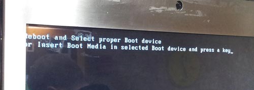
Too bad the weary traveler has no way to follow any of these cryptic instructions.
In fact, we run all too often into this situation: a computer-embedded system that sends admin-level error messages at a user that has neither the ability nor the expertise to address them. A simple blinking red light captioned “malfunction – call maintenance at tel. 1234567” would at least be actionable!
Here are two retractable tape measures. The one on the left is a classic by Stanley, the other, made by Panyi, clearly a cheaper clone. Looks the same, works the same… except for one small difference.
Notice the difference?
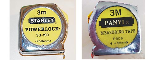
This type of tape measure has a stated offset printed on it, equal to the width of its metal case, to allow taking inner measurements. In the Stanley unit, the number is +50 mm, a clean round number that’s easy to add to the number you read on the tape. I also have a Stanley tape of different design that uses +60 mm… again, a nice round number.
But the cheap knock-off uses +55 mm – far less easy to rapidly add in your head. Couldn’t the manufacturer bother to add or subtract 5 mm to the case size?…
Bad, bad designer!
Today we have a guest post from our loyal reader George Trudeau of Hyannis, Massachusetts.
George sent me this photo:
And here is the story:
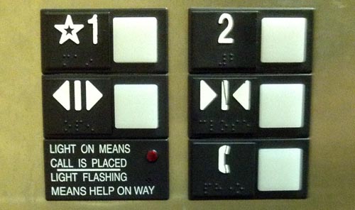
I went to a Doctor appointment and took the elevator up to the second floor office by pressing the great big 2.
When I left the office, I was still thinking more about my appointment than how to operate an elevator, so I pressed the button under the 2, the doors closed, and I returned to my thoughts. Eventually I realized nothing was happening so I pressed the button under the 2 again… It even has arrows pointing to it.
If I wanted to go sideways I might have pressed the right button the first time.
Nice catch! Not only is the up/down direction represented sideways, but the line in the “Close doors” icon does look like a “1” in the same style of the “2”. Of course, you have to be distracted to make this mistake… but usability is about ensuring proper user interpretation even when distracted!
Here are the headlamps of two Mazda cars. On the left, a Mazda 323 from the first half of the past decade, the other a Mazda 3 from the second half. Both fine family cars.
See the difference in design strategy?
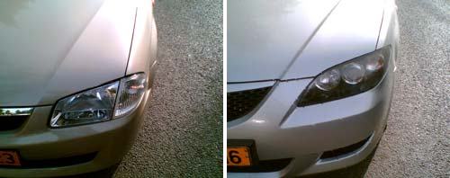
The car on the left has the headlamp split into two parts. The one on the right uses a single assembly.
Why do I care? Because when either lamp gets broken in an accident – and for the outer, the turn signal, this can be even a minor scrape – you need only replace one small cover in the older car, and the entire large assembly in the new one. An assembly they will charge you a ridiculously high sum for.
And yes, some may find the newer design more aesthetic; but the modern highway is a battlefield, not an art museum. We’re better off with cars designed with repair cost in mind. But then, it’s easy to conjecture that that’s what they are – just not in the owner’s interests…
Here is the control panel of a counter-top cold/hot Tami 4 water bar. Push a button – you get hot water. Push another – here’s a refreshing cup of cold water.
But… which button?!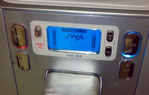
Of course, that’s why the buttons – all seven of them, for there’s a lot more you can make this glorified water faucet do – are labeled! The problem is, only one – wisely perhaps, the one labeled “Extra hot” – can be easily read. The others have the label printed on mirror-like shiny surfaces in light gray, which means you need just the right angle of lighting and viewing to make the text out at all. See the photo – the legends on the right are visible (though at very low contrast) while of the two on the left the top one is just barely readable and the bottom one is totally invisible.
They say writing was invented in the fertile crescent in the 4th millennium BC… but we had to wait till our day and age to invent invisible writing.
Yuck!…
Not all cool ideas are actually good.
Back in 1983, around the time the IBM PC made its debut, my boss at Intel had acquired a very innovative personal computer: the Hewlett Packard 150.
I remember it well; it was a really cool machine – at least in the context of its day: it had an 8MHz (yes, 0.008 GHz) CPU and 256KB (0.000256 GB) memory, as well as two floppy disks of 270KB each. It also had that solid look and feel that the better companies gave their machines when they could charge thousands of dollars for them. But what made it super cool was the screen, and the ad here shows you how proud HP was of developing it:
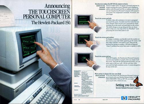
The HP 150 had the first Touch Screen I’ve ever seen on a commercial computer. It was actually a regular nine inch green CRT, with a bezel that had holes all around it with IR emitters and detectors in them; sticking a finger at the screen would block some IR rays and tell the computer where you were pointing. And this is where the designers had failed: they forgot that the human arm is not designed to be held in the air, poking at a surface in front of one’s face. The resultant muscle fatigue was known as Gorilla Arm…
That alone was enough to relegate this screen to the junk heap of failed ideas, and touch screens would have to wait for tablets and devices that can lie flat on a tabletop or be held in one’s hand.
Still, you have to admit it was a good looking machine!
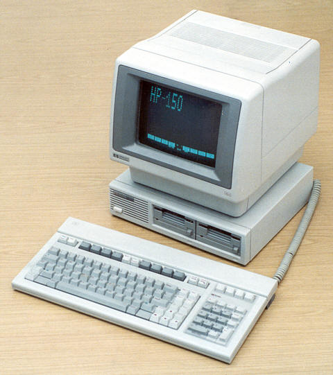
Photo source: Computer museum, Stuttgart University.
 One of the first scientific facts you learn as a child is that snowflakes, those lovely art creations of nature, have a six-fold symmetry. And they do; the properties of water molecules see to that. Hence the standard symbol for snow (and freezing, and cold in general).
One of the much later facts you learn as a scientist is that crystals almost never have five-fold symmetry. The rare few that do are called quasi-crystals; my countryman Dan Shechtman got a Nobel prize for discovering those.
So imagine my surprise, on traveling in a Peugeot 308 recently, when I looked at the gear shift and saw a button marked with this amazing symbol:
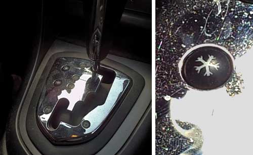
The button apparently activates a special program for driving on snow, a wonderful feature (though not, really, in hot Israel); but what on earth were these French designers thinking with this five-pointed abomination?
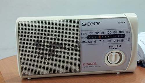
Sure thing, Form should follow Function… but some designers haven’t heard of that. Like the Sony designers responsible for the two weird design choices below.
Round knobs are round because they need to be gripped and rotated… an optimal design for our opposable-thumb grip.
But the radio below has a round knob whose function is to slide right and left between two positions. There are wonderful switch designs for that, some going back to the Industrial Revolution… and their oblong form reflects the lateral movement. Not here, though…
And then there’s this little stereo system I use in my home office:

This has four shiny round knobs, of which one – at the right – actually rotates to control the sound volume. The other three are flush with the panel and are actually two-way momentary push-button switches – you push the top or bottom part of the control for a “click” that might advance the tuning or track up or down. The use of a round form here is an abomination, and each time I use them I go into a tiny cognitive dissonance. Fortunately, the sound quality is good enough to put me in a forgiving mood…
I came upon this well-meaning sign at a university guest house. Can’t fault its call for responsible behavior, but what were they thinking when they created it?

It never ceases to amaze me how little attention people pay to creating text that is easy to read. You see PowerPoint slides with red text on a blue background, which is an incredibly poor choice for visual contrast. And here they were perhaps thinking that the visually cluttered garden in the background would make the lettering easy on the eyes!
Though, to be fair, they probably weren’t thinking at all…
Those depressing multi-story parking structures are an unavoidable part of a driver’s life… and they can get quite annoying when you need to find your way out of one. Sure, there are signs. Here, for example, is one garage that takes no chances on our missing the exit, and advertises it bilingually and redundantly:
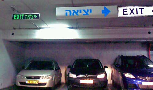
The only problem is, it fails to say whose exit it is to the right: pedestrians or cars? This is a very common sort of confusion in such car parks, since cars and people exit them from quite different places.
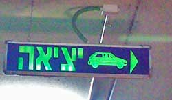 So here is the right way of doing it! The sign to the right (found on another level of the same car park, strangely enough) leaves no doubt whatsoever: cars should exit to the right. I don’t remember if they had a similarly unambiguous sign for pedestrians, though those are usually marked with a running person for safety reasons. Anyway, isn’t this simple sign design convention something that every parking structure in the world should have?
 When Elisha Otis invented the ‘safety elevator’ mechanism in 1852, elevator crashes have become a rare event indeed. But these days “crash” has a new meaning, which Otis couldn’t have foreseen. Consider the elevator in the photo, from the Azrieli towers in Tel Aviv. It has a wonderful new control system with a large computer screen to tell you what’s going on.


 One of the first scientific facts you learn as a child is that snowflakes, those lovely art creations of nature, have a six-fold symmetry. And they do; the properties of water molecules see to that. Hence the standard symbol for snow (and freezing, and cold in general).


 So here is the right way of doing it! The sign to the right (found on another level of the same car park, strangely enough) leaves no doubt whatsoever: cars should exit to the right. I don’t remember if they had a similarly unambiguous sign for pedestrians, though those are usually marked with a running person for safety reasons. Anyway, isn’t this simple sign design convention something that every parking structure in the world should have?
