Back from vacation, having flown a Boeing 737. This lacked the personalized screens seen in longer haul craft but it had a headset jack and a set of volume and channel controls for each passenger. The controls were set in the armrest, in easy reach of the passenger, like this:

Cool, huh?
Not cool. The two rocker switches for the volume control and channel selector are flush with the surface of the armrest. This means that if you rest your arm on the thing – or if your neighbor in the next seat does – your channel is bound to skip up or down every few minutes. If you watch a movie this can get truly aggravating.
And all they had to do was recess the controls a couple of millimeters under the surface…
Was in Germany and saw these in a supermarket. The thing is called Bischofsmütze – which means Bishop’s hat, although there’s something vaguely oriental (Islamic oriental, I mean) about it.

This is the weirdest fruit I remember ever running into – it looks like it’s a mashup of two different species, with the poor attention to finish seen in Frankenstein’s monster…
My first reaction was, that settles the heated controversy: surely no intelligent design can be seen in this ridiculous fruit! But then I had to admit: even the most meticulous designer may express a sense of humor now and then… 🙂
Here we have two glove compartments. The one on the left is from the Renault Clio; the other from a Mazda 3. They serve the same simple function and – not surprisingly – look pretty much the same, if you ignore the nice touch in the Mazda’s, that places the latch closer to the driver.
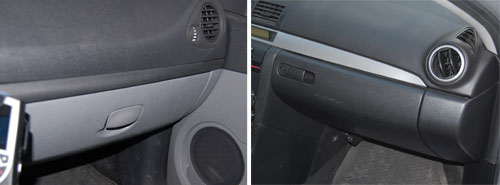
To be precise, they look pretty much the same from the outside. When you open them you see a world of difference.
Here is the one from Renault:
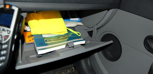
It goes pretty deep under the dashboard, so you can stick a lot of stuff in there – an advantage for sure. But the angles and the door design are such that the moment you open it, everything is liable to spill out in a mess.
And here is Mazda’s design:
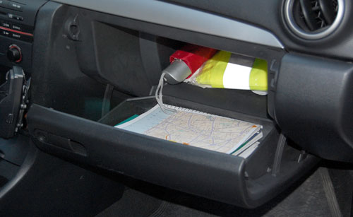
Here, there is a deep section behind, and a door designed like a separate deep tray; and the geometry ensures what you put in the inside part stays there, and what you put in the door remains in the door, ready for you to reach in and take what you need.
Two designs for the same function: a poor one and a superb one. And they cost the same to produce, no doubt…
See the hilarious street sign.
Why is it hilarious? Well, if you can read Hebrew you don’t have to ask. For the rest of you, here is the story.

Palermo, where this sign hangs, was home to a large and lively Jewish community in the middle ages. Then, in 1492, the Catholic Monarchs (Ferdinand and Isabella, those of Columbus fame) found the time on their busy schedules to decree that all Jews be expelled from all their dominions, Sicily included, and that was that – even today the only Jews to be seen on this lovely island are tourists. Moslems didn’t fare much better, having been expelled in the 13th century.
And it is to this history that we owe the sign, which marks one of the streets of the medieval Giudecca – the Jewish Ghetto. Someone had the neat idea of adding Hebrew and Arab names to streets in that area, in acknowledgement of their history. So far so good.
The joke, however, is that with not a single Jew living there, the Sicilian sign makers evidently relied on someone sending them the Hebrew version of the street name – which they then diligently proceeded to copy, without any idea of how to read the Hebrew script. The result is a hilarious mess of typos, most notable the replacement of the letter Yod with an apostrophe, no less than six times in this example.
I have no idea if the Arabic is any better…
Here is a street sign from Tel Aviv’s Ramat Hachayal area, a vibrant hi-tech hub. The sign hangs on a building at Hanechoshet st., as stated in English.

The Hebrew is more detailed: it has the street name at the top, followed by the fine print, which explains the name. Nechoshet in Hebrew means copper, and so the text on the sign educates us:
Copper st. / An easily worked metallic element. Serves primarily to make thin electric wires.
Well, Duh!…
The origin of this utterly unneeded explanation can probably be traced to the commendable practice of adding explanations to street names referring to little known persons or events, such as
Rafael Weiss st. / Biblical scholar, 1940-1974.
Not every passerby can be expected to know every biblical scholar, or politician, or artist from bygone generations, so this is somewhat useful.
Knowing when to break a standard mold and leave a field empty in a template is a sign of intelligence…or perhaps a sort of mini Turing Test?
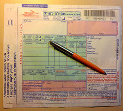
So we had to ship some parcels overseas, and we were given these forms to fill at the post office.
Not surprisingly, the form had four copies, and asked for a lot of shipping and customs information. what was surprising, however, was the incredibly poor functional design of the form’s layout.
Most obviously silly was the layout of the field for the recipient’s address, which you can see in the photo below:
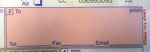
The small area provided would barely accept any respectable street address, but then they ask you to add telephone, fax and email on the indicated lines. Forget about a.very.long.email.address@long.host.domain.com – you couldn’t even fit short@gmail.com on that tiny line! Same thing for any respectable phone and fax numbers. Nor can you try your hand at miniature calligraphy, because to mark the four copies you must push very hard on the pen…
Every day hundreds of people in the country struggle with this form. Won’t anyone at the PO take pity on us?
One can hardly imagine a more fun child’s plaything than a toy balloon. These have been around in various forms since the middle ages at least, and are as pleasing to today’s children as ever. And they generally look like the balloon in the illustration below, from the classic children’s book, beloved by generations of Israeli children, “Tale of five balloons”.


But not at McDonalds. I visited one of their ubiquitous locations last week and saw at the counter the balloon you see at the right above. The poor thing was peppered with… legalese.
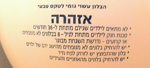
For those of you whose Hebrew is rusty, here’s what it says:
The balloon is made of natural Latex.
WARNING
- Not suitable for children under 36 months of age.
- Suffocation risk for children under 8 from uninflated or torn balloons – adult supervision required.
- Keep uninflated balloons out of the reach of children.
- An exploded balloon must be immediately thrown into a trashcan.
- Keep balloons away from the eyes and ears.
Sigh…
Something caught my attention in this children’s playground in our neighborhood, where my kids used to play long years ago.
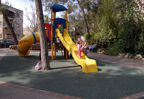
Back then the slide was made of metal, but the new one works just fine. However, back then the slide ended in a large sandbox, which was a major attraction in its own right. Kids would dig, build sand castles, mess around and have fun.
Not any more, as you can see: the sand has been replaced with some green rubbery material. This must have seemed a great idea – clean, easy to maintain, resilient and safe. However, consider this line from Wikipedia:
Sandpits encourage the imagination and creativity of children by providing materials and space to build several structures such as sandcastles; use toy trucks, shovels, and buckets to move the sand around; dig holes and bury objects, etc. In other words, the sand provides a medium in which children can pretend to explore, construct, and destroy the world in three dimensions.
With this ersatz version, kids can do none of these things. They can stay clean and hygienic, certainly; and safe, so nobody gets sued.
Still,my kids, and my own generation, and countless others before it, have managed quite well with the sand.
Sigh…
 Here is a photo I snapped in a kitchen area in a company I visited. See what’s wrong?
The refrigerator sits close to the wall on the left, and its door opens to the right (handle on its left side). Which means the person opening this door has to do a little dance to get into the space between the opening door and the wall.
No big deal of course, but it’s an unnecessary inconvenience: you can buy fridges with doors hinged on either side; often you can change the side even after the purchase. Many people are unaware of this possibility, or don’t bother. In this case, all the employees on that office floor have do the dance because someone didn’t care…
I was at a fancy home and kitchenware store and saw the box in the photo here, containing – it says on the front – “Salt & Pepper Napkin Rings”. This sounded weirdly intriguing, like “Oregano & Thyme Spark Plugs”, so I took a closer look. Turns out this is one of the stranger design ideas I’ve had the pleasure of meeting.
 Napkin rings, in case you haven’t dined in the fancy places that use them (I don’t, but my grandmother used to have them before paper napkins appeared), are used around linen napkins when setting a table. What do they have to do with condiments? Well, as you can see in the close up, each of these rings has two inner compartments that can be filled with salt and pepper, giving each diner a personal set of shakers… combined into one unit (a dubious idea IMO), integrated into the napkin ring (a terrible idea IMHO).

So why is this a bad idea? Many reasons, from the hassle of having to keep them all filled, to the inevitable spills when a ring is overturned, to the difficulty keeping one condiment in while pouring the other out… but primarily, because why on earth do it? A Swiss Army Knife has its benefits when you’re a Swiss soldier, or a boy scout… but not every set of disparate functions need to be designed into an uneasy coexistence!
Have to hand it to them, at least… if you ignore the two plastic stoppers, the ring is surprisingly elegant looking! 🙂

