This morning I get in the good ol’ red Renault Clio, put it in reverse and start backing out, when the car emits a persistent beep.
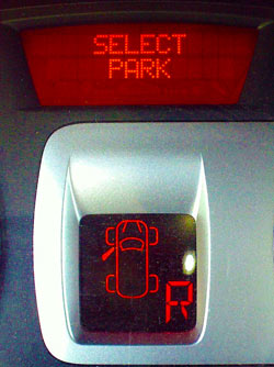 I stop and scan the dashboard, and there I see a message on the alphanumeric display: Select Park. I do put the gear in Park, and everything is back to normal. I try to reverse again – beep and message return.
This makes very little sense, so I stop, pull out the owner’s manual and look for error messages. There is a pageful of them, but no mention of “Select Park”. I feel like those brisk officers in action dramas that say to their panicky men “Talk to me!”… but the car isn’t talkative, merely cryptic.
After a while I notice the overhead lamp is on, so I realize the door isn’t fully latched; I slam it shut, the car is happy, and I’m off to a day’s work. But the Select Park message is now a nominee for worst car error message ever. Consider:
-
With the same display they could’ve made it say “Close door“, or “Door open“. Could’ve? Heck, should have!
-
Note the lower display, which does indicate an open door. Problem is, the Select Park message is so much more prominent and puzzling, that the second display failed to register in my mind altogether.
-
The beep and text alert only work when you’re in reverse motion. This makes no sense, and had me looking for a cause to do with this specific mode.
Bottom line: error messages should explain causes, either directly (Door is open!) or indirectly (Close the door!). A message that essentially says “Freeze! Something is wrong!” is no good.


0 Responses to “Poor error message design in a car”