One evening a neighbor knocks on my door. She just got a new cellular phone, and she has a basic question: which key does she press to accept an incoming call?
Now this lady is not a youngster, but she’s used cellphones before; surely she must know that you press the key with the green handset image? Well, yes, she knows, but she can’t figure out which key that is. I think, Huh??? … But then I look at her instrument, and I see what she means. What used to be an image of a handset has degenerated into a tiny thin squiggle, similar to other tiny thin squiggles on some other keys. And yes, perhaps she could discern that this squiggle is a bit greenish, especially if she had a magnifier…
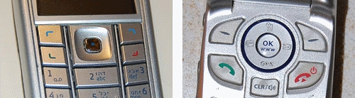
The problem is all too visible in the left photo, which is of my own Nokia 6230i: the four keys at the top have identical looking thin marks, and the colors of the bottom two, though red and green, are very hard to discern at a glance (which is the way they should be discerned; especially when you’re driving with the phone in a hands-free cradle). Compare this to the other photo, from a different model. That’s what good human engineering should provide!
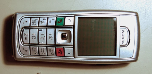
So, what can we do about this? If you work at a cellphone manufacturer, by all means have a word or two with your design department… I don’t, so all I could do was fix my own problem. Here is what I did to my Nokia. Problem solved.


2 Responses to “Invisible buttonware”